


 I met Chris and Shauna back at the first of the year and have been working with them all the way up to there beautiful event in Michigan a few weeks ago! Shauna has an amazing attention to detail and wanted something super unique for her wedding invitations. We incorporated a paisley design on the invites and insert cards and printed in a garnet red and gold ink. The colors meshed so perfectly with all the details of the inserts. My favorite thing about these invitations is the green reception cards. This was an idea that Shauna had to do little pictures to create a timeline for the evening events. I just love the added detail and personalization it adds!
Shauna and Chris, you guys where amazing to work with and I love your creativity! Thank you so much!
*Check out pictures from Shauna and Chris's wedding that are AMAZING by Rebekah Westover
Tuesday, August 26, 2008
Shauna & Chris!

Thursday, August 21, 2008
The Fall Bridal Extravaganza!
 Come check out Pink Piggy this Saturday at the fall Bridal Extravaganza at the Grand America Hotel! Lots of great new designs to show off!
Thursday, August 7, 2008
Lindsay & Jonny's Wedding!
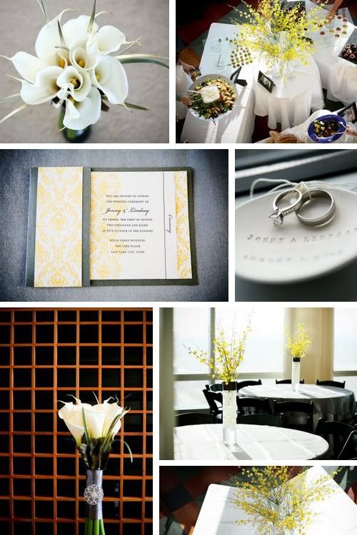

 Here are a few pictures from Lindsay & Jonny's wedding! Their colors where charcoal & saffron.... super hot colors for the year! I thought this design board would be nice to see how the invitations flowed with the rest of the decor! The floral design was done by the amazing Audrey with Studio Stems and awesome photography by Dustin Izatt with digital izatt.
For the invitations we did a charcoal scored pocket with a "vintage Hollywood glam" design printed in yellow on top of a light gray shimmer stock.
Thanks Lindsay! You where so much fun to work with!
Tuesday, August 5, 2008
08.05.06


 Today is my anniversary with the best hubby in the world! Two years ago today we got married at the beautiful Millcreek Inn and I thought I would share some of our wedding pics!
Monday, July 21, 2008
Lindsi's Invites!


 We designed Lindsi's invitations around her fall wedding she chose the colors: brown, deep red and ivory. For the pocket we went with a neutral campaign color and accented the outside of the pocket with a deep red ribbon wrap and initial seal. In the inside of the pocket we backed the invitation with a deep red shimmer stock and printed on an ivory shimmer stock in brown ink. Lindsi and Brandon are getting married at the beautiful and romantic Millcreek Inn and these invitations perfectly represent their classy fall affair! Thanks so much Lindsi and Brandon and best of wishes to you guys!
Sunday, July 13, 2008
Chelsea's Invites!


 Chelsea was so much fun to work with and her invites really show off her fun personality! For her invitation Chelsey wanted to do something not to traditional and really bright. We went with a hot pink custom score pocket that was accented with a green and white polka-dot ribbon for flair. We printed the invitations on white shimmery stock in black and matching apple green ink and backed them with a black linen stock. For the insert cards we added a paisley design for a little extra chicness! To seal the deal we printed a custom return address on the back flap of the eye catching hot pink envelopes! I love it when people do colored envelopes..... it just adds to the uniqueness and style of the event. Thanks Chelsea.... you are awesome!
Friday, June 20, 2008
Lauren's Save the Dates & Invites!


 Lauren contacted me all the way from Washington, DC to design her save the dates and wedding invitations and check out how great everything turned out with only talking via phone and e-mail! We started with designing the save the dates. Lauren wanted these to be a little more fun so we did an azalea pink 4x5 Z-fold card with a pyrite backing and printed on an ivory matte stock. We created a monogram design that was used on the save the date as well as for the return address on the back of the envelope. We used an ivory ribbon to close the card.
Wednesday, June 18, 2008


Wednesday, June 11, 2008
Clarissa's Invites!


 Clarissa and Eric's colors where purple, light pink, and forest green. When they first told me what their colors where I thought that they where an interesting and different combination of colors to choose.... but I can't get over how amazing they look together! We chose a dark purple pocket fold, with a light pink backer, a thin forest green layer, topped with printing on an ivory linen stock. Clarissa and Eric wanted to incorporate a damask design to create that bold eye catching look that we used alternating in purple and green ink. To close off the pocket we used a custom designed monogram square seal.
Thanks so much Clarissa and Eric!





 Posts
Posts

